

Instructions for Using Excel
Graphs are an important part of scientific publications. While many scientists use software such as MatLab or Mathematica to produce fully customizable graphs, the most widely available software package used by students and professionals alike is Microsoft's Excel. Unfortunately, the default settings for producing graphs in Excel are pretty poor. In this section you will learn how to prepare and format graphs so that they are ready for publication.
The instructions listed here are for Microsoft Excel for Mac 2019 or later, which is the version used on school computers. Since 2011, Excel has been using a toolbar called the "ribbon," which looks like this:

The ribbon can be toggled on and off by clicking whatever tab is active (in this case it is the Home tab. You will also be using the menu bar at the top of the screen, which appears like this:

Setting up the worksheet
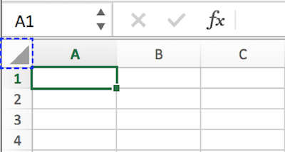
A spreadsheet is composed of cells that have a column that is denoted by a letter and a row that is denoted by a number. The cell that is highlighted in the image below is called cell A1, which is a combination of its column letter (A) and its row number (1). Before we enter any data, make sure to change the font for the entire worksheet to Times New Roman. This is done by clicking on the lower triangle marked in the blue dashed line in the image below, which selects all cells in the worksheet. Then, make sure the Home tab is showing and select Times New Roman from the pull down list. The default font size should be 12 point so you won't need to change this. Be careful when you paste anything into Excel because the font and font size will copy over from the document you get your data from.
Example data
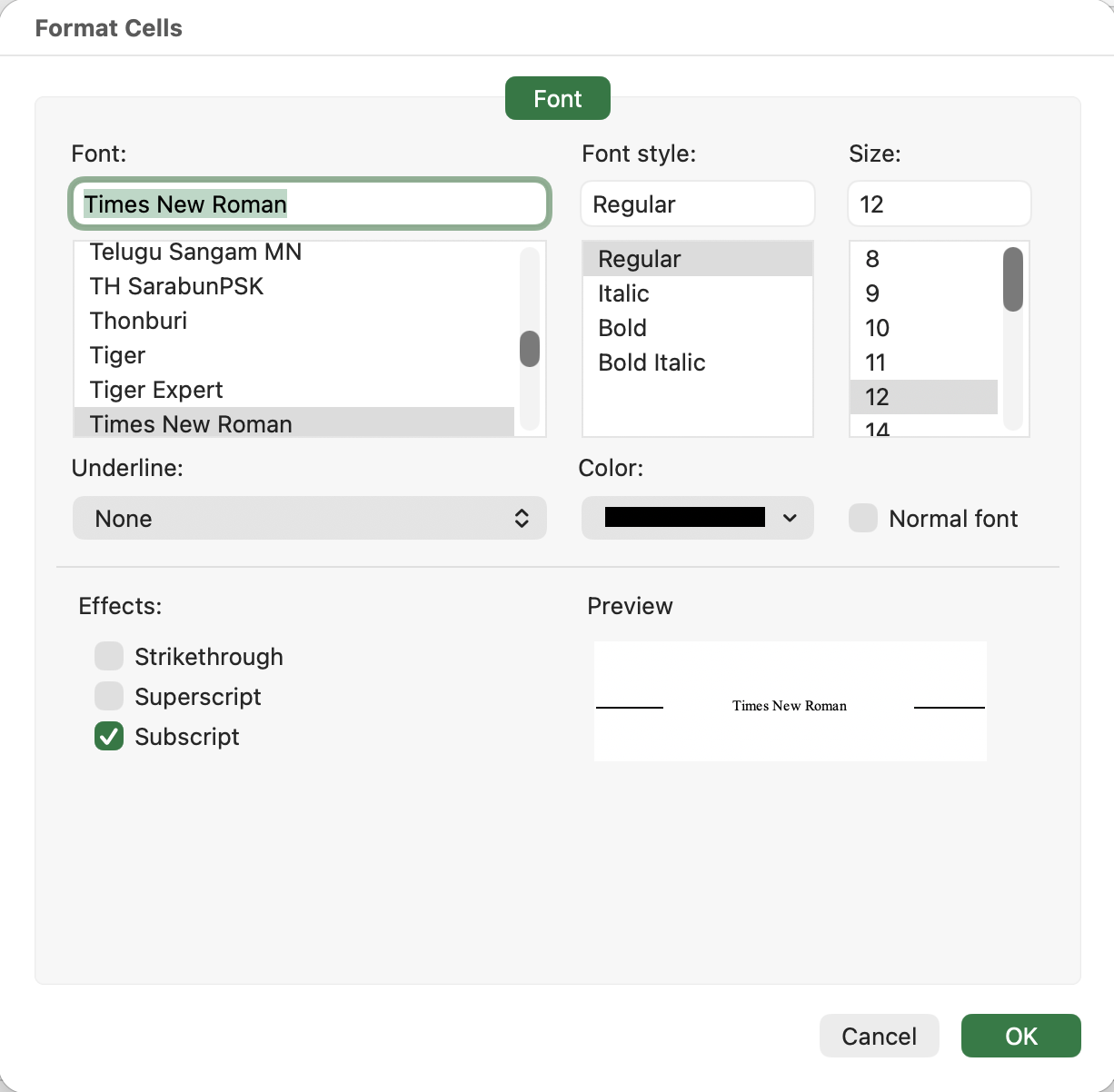
Let's start by inputting a data set with normal force in column A and static friction force in column B. Of course, your data may be different so make sure to use the correct header for your lab. All data tables will have a header row, which will be bold and centered, with units appearing in parentheses. In cell A1, we enter FN (N) and in cell B1 we enter Fs (N). The N in parentheses is the unit (Newtons) and the FN stands for normal force while Fs stands for static friction force. Since the N and s need to have a subscript, we use Command-1 to bring up the Format Cells menu. Alternatively, you can select Format in the menu bar and Cells. First, let's edit our text in cell A1 and select the N next to the F. Bring up the Format Cells menu by pressing command 1 or selecting with the menu. Select the checkbox next to the Subscript and press Ok.
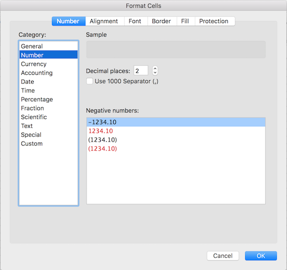
Repeat the procedure with the s next to the F in cell B1. Now let's format our A and B column to have two decimal places. By clicking on the A above column A, we can select the entire A column. Hold down Shift and click column B, which will highlight both columns. Use command 1 to bring up the Format Cells menu and click the tab called Number. Under category, select number and change the decimal places to 2 (this is default so you shouldn't need to change anything.) Different labs will require different number of decimal places, so make sure to use the info given in the lab. Press Ok.
Formatting the table
Now enter the data as it appears below (or enter your own data if you are making a graph).
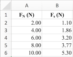
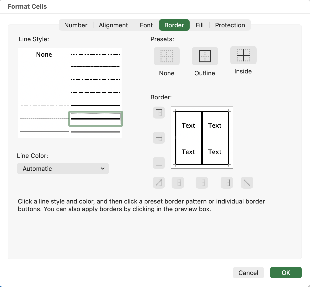
To bold and center the header row, simply select the cells in the header (in this case cells A1 and B1) and use the shortcut Command-B for bold and Command-E for centered text. We also apply a border around the table as well as borders between columns. To do this, select the entire table (in this case cells A1 thrrough B6). Then select Format Cells and click on the border tab. Select the thickest line in the second column, second from bottom, then click on outline, followed by the vertical bar in the bottom row underneath the Border section. This will create the borders indicated in the screenshot below. When you are done, click Ok. To create a border underneath the header row, select the header row (in this case cells A1 and B1). Repeat the previous steps, but only select Outline this time, and press ok.
Creating a Graph
Begin by clicking on the middle of cell A1 and dragging to the middle of cell B6 to select all the data. You can either use Insert, Chart, X Y (Scatter) from the main menu or click on the insert tab in the ribbon. You should see the following chart menu in the ribbon:
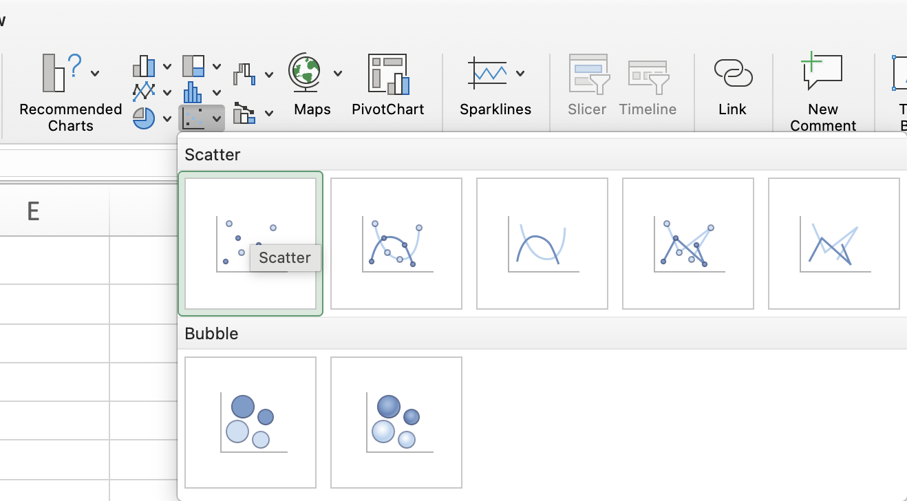
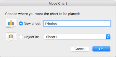
In most cases we will select Scatter (top left), whereby a chart will be generated and inserted in your worksheet. You will then need to move the chart into its own sheet by clicking on Move Chart from the Chart Design tab in the ribbon, or control-click the chart and select Move Chart from the options. You will see the following dialogue box, where you select the radio button next to "New sheet" and name the sheet "Friction." Your graphs may have different names depending on the lab.
Formatting the graph
Chart Title and Gridlines
The first thing we will do is to remove the auto-generated chart title at the top of the graph by selecting it and deleting it. Remove the horizontal and vertical gridlines by selecting and deleting them in your graph.
Data Points
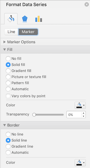
The color of the data points needs to be changed from the default blue to black. This is done by double clicking any data point, which will select all data points and cause a Format Data Series window to pop up. If the window on the right says Format Data Point, click off the data and click once on any data point.
Click on the paint bucket icon, then select the Marker tab underneath. Under the Fill option, the color should be changed from blue to black, and under the Border option, the color should be changed from blue to black. The end result should appear similar to the picture below.
Axis titles
Axis titles are required for every graph. To add a horizontal axis title, make sure the Chart Design tab is selected in the ribbon, select the Add Chart Element and choose Axis Titles, Primary Horizontal. Change the default "Axis Title" to "Normal Force (N) on the horizontal axis. Now repeat for the Primary Vertical Axis, changing "Axis Title" to "Static Friction Force (N)." Note that if your units require a superscript — these do not — you will have to manually format as a superscript by selecting the character, then control clicking on the label and checking the box next to superscript. The carat ^ is not acceptable for indicating an exponent.
Fonts for Axis numbers, Axis titles and Trendline labels
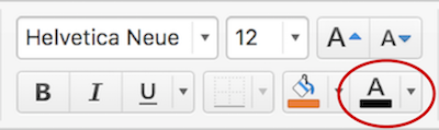
You must change the font for all graph elements to Helvetica Neue 12 pt. Start by clicking on one of the X axis numbers to highlight the x axis. Then click the Home tab in the ribbon, and change the default font from Calibri 9 pt. to Helvetica Neue 12 pt. The font for axis numbers and axis title should change correspondingly. Then click the font color icon shown by the red circle below, and click on the color black to change the font color from the default gray to black. Repeat for the Y axis numbers. Now click on the X axis title and change to Helvetica Neue 12 point black. Repeat for the Y axis title.
Formatting decimal places
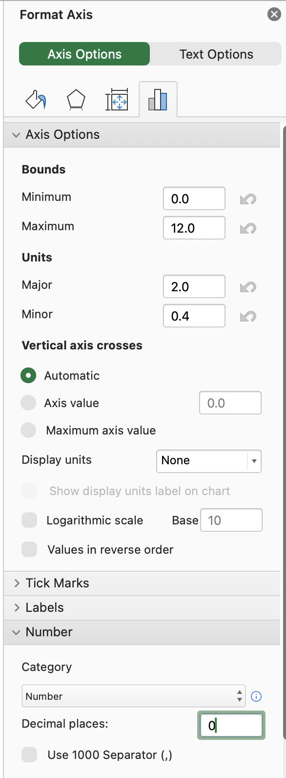
The number of decimal places must be formatted for the X and Y axes to remove unnecessary decimal places. Since both the X and Y axes change by every 1 N, the number of decimal places should be set to zero. Click on the X axis, then in the Format Axis window click the three vertical bar icon, which is the Options. At the bottom, click the arrow next to Number, and enter zero under Decimal places. Click ok and repeat for the Y axis. While we are on this menu, we will change the Major units to 1.0 and the Minor units to 0.5 for both axes. This will control the tick mark placement and the numbering of both axes.
Tick marks
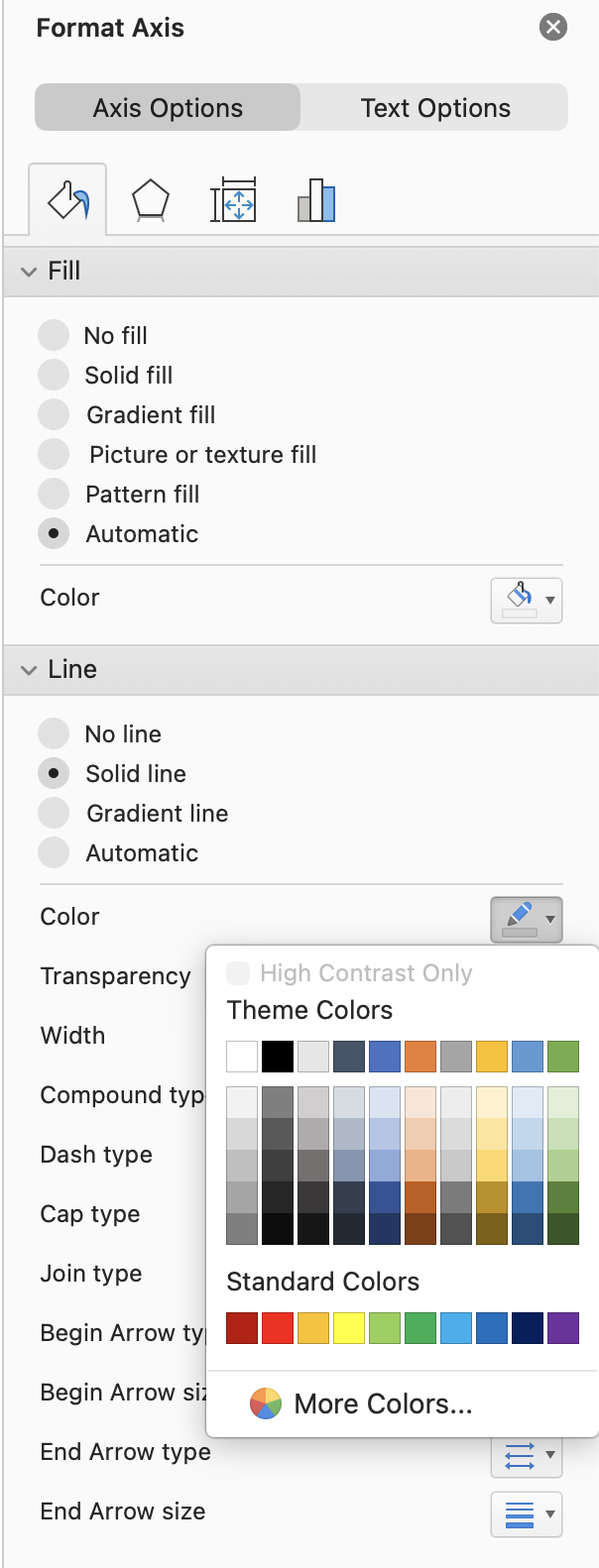
Click on the X axis and in the format axis window click on the three vertical bars (options). Expand the tick marks menu and in the pull down list choose Inside for both Major an Minor type. Repeat for the Y axis. The axis color should be changed to black by clicking on the axes, choosing options and changing the line color to black (see image below).
Trendlines
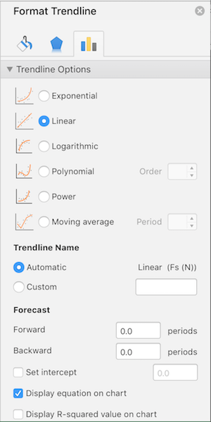
A trendline is the term Excel uses for a least-squares linear regression. We will be using the linear trendline mostly, although there are other types as well. Click on one of the data points, then make sure that the Chart Design tab is selected. Under Add Chart Element, choose Trendline, then Linear. A dashed blue line will appear through the data points. Now select the trendline by clicking on it. In the Format Trendline window to the right, click on the Fill & Line tab. Under Color, change the default blue to red (second to the left under standard colors). Then under Dash type, choose the solid line (top selection). Width should be set to two. Then choose the Trendline Option tab, which appears as three vertical bars. Select the "Display equation on chart" option. Your trendline options should appear similar to those below.
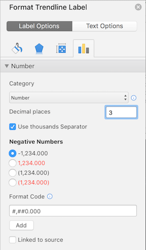
Finally, drag the trendline label (the equation) away from the data set so that it does not overlap. Under the Format Trendline Label tab, choose Number under category, and change the number of decimal places to 3, which is appropriate for this data set. Your trendline options should match those below. Don't forget to change the trendline label font to Helvetica Neue 12 pt.
Final Result
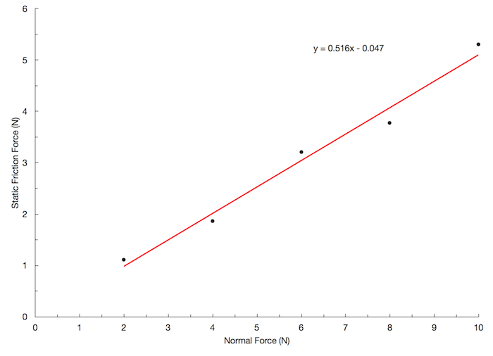
Your graph should look as follows: